Ten Principles of Good Design Redux | Part 2
“Of course software makes a product useful! Software is useful by design!” I hear you say. But is that really always the case?
At the beginning of this year I received a Blackberry smartphone from my employer. It was not one of the current-generation touchscreen devices, and I can’t speak directly to how useful those devices are, but the device that I received was not useful in the least. The combination of the form factor, the trackball input device and the very poorly designed user interface rendered the device practically useless to me. Despite the fact that this was a paid-for smartphone, with both voice and data covered, it sat in my bag unused for months. I eventually just sent it back and decided to cover my own communication costs rather than be subjected to the Blackberry user experience. I never even bothered to find out the model number, but it looked something like this.
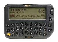
I do know people who swear by their RIM devices, but I think RIM’s recent poor performance speaks in part to their inability to design and ship useful devices; this is the company who shipped a great tablet platform hobbled by its dependency on a Blackberry smartphone to enable its PIM features. And the sad thing is, there was a time when they were thought to be the embodiment of “useful”; I recall getting a Blackberry pager when I first joined Microsoft Corp. in 2000. It looked like this.
It became the most useful piece of technology I owned. So what happened between then and now? The form factor of the phone that I found unusable in 2011 was the logical evolution of the pager that I found indispensible in 2000.
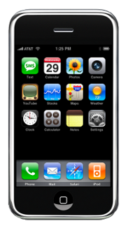
This happened.
And the iPhone reset the “useful” bar. Dieter Rams is a huge Apple fan, and so am I. I want to quote the description of Rams’ principle as it appears on Wikipedia because it so precisely describes Apple’s apparent approach to designing useful products.
“A product is bought to be used. It has to satisfy certain criteria, not only functional, but also psychological and aesthetic. Good design emphasises the usefulness of a product whilst disregarding anything that could possibly detract from it.”
When I use any feature of my iPhone I can visualize the team of designers and engineers brutally redesigning and refactoring that feature to make it as useful to the user as possible. Though RIM’s devices are functional, they were clearly not designed to be beautiful and give their users a deeply satisfying visceral experience. And though there are things about the iPhone that bug me, for example the lack of ability to “skin” the user interface, they do not detract from the overall experience, because it is just so bloody great!
As an aside, I recently saw Microsoft’s new mobile operating system, codenamed “Mango”, running in the wild. It is beautiful. That is not a word that I use to describe Microsoft products very often, but it is totally apropos in this case. Though the predominantly monochromatic tile user interface metaphor is very bold, it is offset by a number of subtle visual elements and the Metro typography, which makes the whole experience highly pleasing, usable and ultimately useful. There is definitely a Windows Phone in my future.
I think Rams’ “useful” principle is applicable to far more than just User Interface and User Experience Design; Software Architects should deeply consider the usefulness of the technology that they design and build, even if that software has no user interface to speak of. Software should ultimately always be designed with the actual living and breathing humans who are going to be affected by it, not just use it, in mind. This is the core principle of Gestalt Driven Development.


No comments:
Post a Comment